It is essential that Audience Feedback is carried out before my Final Edit is complete. This is so that any concerns or things in which I can improve, can be attended to before the Final Edit is handed in. This will ensure that it is the best it can be, and that it will appeal to the Target Audience of my film.
The things in which the peers who assessed my Opening Sequence were focusing on were:
- Titles
- Cinematography/Editing
- Introduction of Characters, Locations, Storyline, Genre and Enigma Codes
- Sound
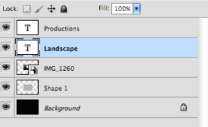
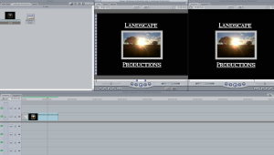
Titles
There were many things which were praised to do with my Titles. The order of the Titles was said to be very well done, with the clear progression in importance being a factor which appealed to the audience. This was also true for the Font, as it suits the genre and overall tone of the video, however one suggestion was to make the text either bigger or bolder in order to stand out a little more. Although I understood the audience’s concern, I was attempting to stick to the Conventions of Social Realism Films in which it is often that there are no Titles, other than the main one, and if Titles are present, they are very discrete and small to not attract any attention which could otherwise be focused on the screen work, which is believed top be the most important aspect of the films. The use of Intertitles instead of Overlay was noticed and proved to be an effective decision, as well as the alternate positioning of the titles, which were said to be good as they were not in the centre and therefore did not distract from the footage which would follow, although Movement within the Titles would add to the attractiveness of them. The way in which the Font Size varies is complimented, adding an aspect of thought to the design whilst still keeping it simple and understated.
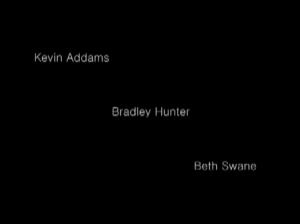
The absence of Character Titles was commented on, which I aim to include, as soon as I can work out how to achieve the desired look.
Cinematography/Editing
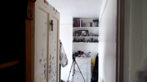
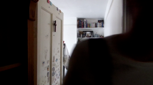
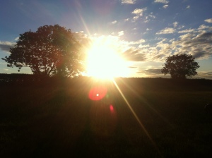
The Props involved with the Mise-en-scene is praised as they complimented the genre and help to identify it as a Social Realism, although the lighting is said to be too light, although I didn’t want to risk it looking to dark on screen and so I purposely filmed in lighter conditions. My wide range of camera shots were said to be effective, particularly the Close Ups and the POV shots which made the bleak start my Opening Sequence something more interesting to watch. During the section of the sequence where the boy is walking through the field, the Camera Movement and the inventive use of Camera Angles was said to be utilised, turning an everyday action of walking into something that looked as if it could be in a film. The slow pace was said to be appealing as it applied to the Conventions of a Social Realism Films, although a few of the shots were said to be too fast and could have been extended, such as the scenery shot where the boy is looking at his surroundings. My method of using a Transition as an alternate way of conveying that the film has jumped back in time and is starting at the beginning of how the boy left home, rather than using the classic Intertitle with 6 months earlier written on it, was said to be an elegant way in which to Transition between time periods.
Introduction of Characters, Locations, Storyline, Genre and Enigma Codes
Characters
The Main Character was said to be introduced well with the majority of the Opening Sequence focused on him. Although some speech could have aided the introduction process and allowed us to get to know the character a little better, the use of Camera Shots such as the mixture of Long Shots to indicate his loneliness amongst Close Ups to allow the audience to see his facial expressions and empathise with him and his situation was enough to express the character. There are also some subtle features such as the cross on the boy’s door which indicate he is a religious person and may offer a more positive representation of the boy. However the parents had very little introduction and what we did see of them was a very Negative Representation, showing the families hardships.
Locations
The fact that his house looks fairly good makes the woods where he ends up look awful in comparison. The audience said that this makes them think about how awful his home life must have been in order to cause him to leave and end up in the woods. The Locations are Represented as very Negative places for different reasons, the boy’s home seems pleasant enough but due to his family who live there, it instantly makes the audience associate his home as a place of abuse. The woods however just seems like a lonely, damp, cold place and not a place that a young teenage boy should be living on his own.
Storyline
The Storyline is said to be very obvious from the outset, and it is easy to pick up what is going on. This is Conventional for most Social Realism Films and it is more about the repercussions of all of the events which pan out in the Opening Sequence in comparison to dramas which involve the guessing game as to why things have happened. There is not a lot I could improve on in the way of introducing the Storyline in the eyes of the assessor in this case.
Genre
The Genre is easily established as a Social Realism. It is said that the uncomfortable nature is an indicating factor, as well as the slow pace. This is then reinforced by the Storyline, with the more complex themes of abuse running through and emphasising that it is a Social Realism.
Enigma Codes
There are many Enigma Codes created in my Opening Sequence as I wanted to follow the Conventions of an Opening Sequence and not give too much away in the first 2 minute. The ones identified by my Target Audience were particularly those to do with the characters involved. The parents were mentioned, which would be introduced more in the rest of the film, but wonder of why they treat the boy the way they do was a big code. Others included why would the boy leave in the first place, and what happened to the other people in his life such as friends. My Opening Sequence is full one Enigma Codes.
Sound
The sound goes well with the film. The emotive music fits with the events happening on screen, is allows the audience to identify that the character on screen is the Protagonist and therefore they should sympathise. The music has a good pace, fitting with the footage shown, the slow pace reflects the boy’s walking speed and it speeds up as he gets nervous before he sleeps out in the woods. The footage on screen could speed up along with the music and be a little faster. Another thing which was praised was the clarity of the characters voices a they spoke, everything was understood clearly. The Background Noise was commented on, not that it was bad, but that it was there, this was purposeful in order to have ‘home noise’ as the family home is rarely a silent place. The added effect that the sound of the boy being hit by his father adds is good. It highlights the abuse which is going on within the home and therefore enriches the sound.


 This meant that I did not follow my